Forms lose more visitors than most people realise. The average form abandonment rate sits between 68 and 70 percent — meaning fewer than one in three people who start a form ever complete it. For lead capture, job applications, and client intake, that's a significant amount of qualified interest evaporating before you ever see it.
Knowing how to reduce form abandonment starts with understanding why people leave — not at the submit button, where most people assume the problem lives, but in the first few fields. The fixes that move the needle are mostly structural: field count, question order, mobile experience, and the copy on the submit button. None of them require advanced analytics or A/B testing infrastructure to implement.
Here are ten specific changes, what each one does, and how to prioritise them.
Why Forms Lose People (The Real Reasons)
The most counterintuitive finding in form abandonment research is where drop-off concentrates. Most abandonment happens in the first three fields — before most respondents have invested any meaningful time. The implication is that the barrier isn't form length. It's the experience of starting.
The actual reasons people leave, in rough order of frequency:
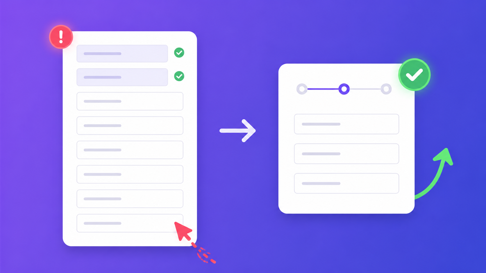
Too many visible fields at once. A single-page form with ten fields signals a large time commitment before the respondent has answered anything. The cognitive load of seeing the entire task at once creates resistance — the same psychological friction as a to-do list that's too long to even begin.
Sensitive information requested too early. Phone number, budget, company revenue, date of birth — these fields trigger hesitation even when the respondent was ready to engage. Asked before trust is established (meaning: before they've answered several easier questions), they become exit points.
A mobile experience that doesn't work. Over 60 percent of form completions now happen on mobile. A form that looks fine at desktop size frequently fails on a phone screen — fields too small to tap, keyboards covering active inputs, submit buttons requiring scroll to reach. Each failure is abandonment.
No signal of how long the form takes. Uncertainty about commitment length creates exit decisions. A respondent who doesn't know if they're 20 percent or 80 percent of the way through will frequently choose to leave rather than find out.
Questions that feel irrelevant. "How did you hear about us?" is a legitimate internal tracking question. To a respondent, it looks like extra work with no benefit to them. The same applies to every field that collects data the organisation wants but the respondent has no reason to care about providing.
Broken validation and slow loading. A form that rejects a valid phone number format, clears all fields on a validation error, or takes more than two seconds to load creates technical abandonment on top of the behavioural kind.
How to Reduce Form Abandonment: 10 Fixes
These ten fixes are ordered roughly by impact. The first three should be the starting point for any high-abandonment form.
Fix 1: Cut every non-essential field
This is the highest-impact change available to almost every form, because almost every form has fields that exist because someone once thought they might be useful. The test is direct: if this data wasn't collected, what would the team do differently? If the answer is nothing, cut the field.
Forms with three fields convert at roughly 25 percent. Forms with six fields convert at roughly 15 percent. That's not a linear relationship — it's a compounding one. Each additional field reduces the completion rate of every field that came before it. The most commonly cut field, and the one that consistently raises completion rates when removed or made optional: phone number. Phone number is the most abandoned field on forms — and the most frequently required field that organisations have the least actionable use for before a qualified lead is established.
Fix 2: Move sensitive fields to the end
Email, phone, budget, company size, and annual revenue all trigger hesitation. They trigger less hesitation after the respondent has invested time answering earlier questions. The sunk cost works in the form's favour: someone who has answered four questions is far less likely to abandon over question five than someone encountering the same field cold.
The practical rule: never ask for phone number in the first field. Move sensitive fields to the last step or the last position on a single-page form. The data they produce is identical regardless of position; the completion rate is not.
Fix 3: Show a progress indicator
Uncertainty about how much is left is a consistent abandonment driver. A visible "Step 3 of 5" or a percentage-complete bar addresses this directly — the respondent can see the end and assess whether it's worth reaching. For multi-step forms, step indicators outperform progress bars in completion rate tests because they're more concrete. For longer single-page forms, a simple "3 of 8 questions completed" indicator is enough. Even a heading that says "Almost there" on the final step reduces abandonment at the point when it should be lowest.
Fix 4: Convert to multi-step structure
Breaking eight fields across three steps of two to three fields each produces a measurably different completion experience than showing all eight at once. The first step should be the easiest — name and email, or a simple yes/no question that requires no thought. Once the respondent has answered the first step, commitment is established and completion becomes more likely than abandonment.
Multi-step forms also allow progress indicators, field grouping by theme, and conditional routing that hides irrelevant questions entirely. The multi-step form best practices guide covers the structural decisions in detail — step count, field grouping, question order — if you're building or rebuilding a longer form.
Fix 5: Fix your mobile experience
More than 60 percent of form submissions now happen on mobile devices. A form that hasn't been tested on a phone before publishing will have mobile-specific failures that desktop testing won't reveal.
The most common mobile abandonment causes: tap targets that are too small for accurate selection on a touch screen; keyboard display that covers the active input field and forces the respondent to scroll blindly; dropdowns that don't behave correctly on iOS; and submit buttons positioned below the fold that require scrolling to reach after the final field is complete. None of these are visible at desktop. All of them are abandonment events on mobile. Test on an actual phone — not a browser emulator — before any form goes live.
Fix 6: Explain why you're asking
"We need your phone number to coordinate the site visit" converts better than "Phone number*" alone. A single sentence of context for sensitive or non-obvious fields consistently reduces abandonment on those specific fields — the respondent understands why the information is being requested and what will be done with it.
This applies most directly to phone number, company size, budget range, date of birth, and any field that could be interpreted as serving the organisation's interests rather than the respondent's. The explanation doesn't need to be long — a single sentence in the field description or as placeholder text is enough. What it does is convert an opaque demand into a transparent exchange.
Fix 7: Mark optional fields clearly
Unmarked fields default to "required" in most respondents' assumptions. A form where every field is marked required — even fields that aren't — creates uniform anxiety and makes the form feel demanding before any question is answered. Mark genuinely optional fields with "(optional)" in the label, or use a consistent asterisk-required convention that's explained at the top of the form. The goal is an honest representation of what you actually need versus what you'd like to have.
Fix 8: Improve your submit button copy
"Submit" is the worst-performing CTA on forms across almost every category of test. It's passive, it describes what the user is doing rather than what happens next, and it carries no value signal. The submit button is the final conversion moment — it should work like a CTA, not a keyboard key.
Better options by form type: "Send My Message" or "Get in Touch" for contact forms. "Get My Free Quote" or "Start My Application" for lead generation. "Submit My Feedback" for surveys, where the word submit is at least relevant. "Send Application" for job applications. The pattern is: say what happens next from the respondent's perspective, not what the form is doing with their data.
Fix 9: Add a completion time estimate
"Takes about 2 minutes" in the form header or subheading reduces abandonment by giving respondents a concrete commitment to evaluate before they start. The key is accuracy — if the form actually takes five minutes and you say two, the mismatch increases abandonment after the first step when respondents notice the discrepancy. "3 quick questions" is more effective than "3 questions" because the qualifier signals intent without overpromising on time.
Fix 10: Rebuild with AI for better defaults
A form generated from a clear description in the AI form builder starts with better structure than most manually built forms — not because the AI is infallible, but because it defaults to logical field order, appropriate field types, a sensible required/optional split, and placeholder text that matches the field purpose. Many high-abandonment forms were built quickly under time pressure with arbitrary field order and generic labels. Sometimes the fastest path to better completion rates is rebuilding with a cleaner structure rather than patching an existing form field by field.
How to Reduce Form Abandonment Fastest: Ranked by Effort and Impact
Not every fix has equal return on the time required to implement it. Here's how to sequence them:
Do today — high impact, low effort:
- Remove or make optional every non-essential field, starting with phone number
- Rewrite the submit button copy to describe what happens next
- Add a completion time estimate to the form header
- Move any sensitive fields to the end
Do this week — high impact, medium effort:
- Convert long single-page forms to multi-step structure
- Add a visible progress indicator
- Test the form on a real mobile device and fix what's broken
Ongoing — medium impact, iterative:
- Monitor field-level drop-off data to find specific problem fields
- Test different submit button copy across form types
- Compare completion rates on multi-step versus single-page versions of the same form
The first group requires no technical changes and can improve completion rates within the same day. The second group requires form rebuilding but produces the largest structural improvements. The third group compounds the gains from the first two over time.
How to Identify Where People Are Abandoning
Fixing abandonment requires knowing where it happens — which specific field, which step, which point in the flow. Generic abandonment rate data tells you there's a problem. Field-level data tells you where.
The three patterns that map to specific causes: drop-off on the first field or before the first field is completed indicates a headline or context problem — the form description, page headline, or initial question is creating hesitation before the respondent is invested. Drop-off concentrated on a specific field in the middle of the form almost always means that field is the problem: it's asking for something too sensitive at that point, the question is confusing, or the field type is wrong for the data being requested. Drop-off at the submit step — respondents who reach the final screen but don't complete — is a trust signal: the privacy policy language, submit button copy, or lack of visible security signals is creating last-moment doubt.
Promptly Forms shows completion rates and field-level drop-off data in the analytics dashboard — you can see exactly which field causes the most exits and use that to prioritise which fix to apply first. Access it from the AI form builder interface on any live form. The data updates from the first submission, so you don't need significant volume before it's useful.
The most actionable thing you can do with abandonment data: pick the field with the highest exit rate, apply one fix (make it optional, rewrite the label, move it later in the form), and measure the change in the following week. Iterating one variable at a time produces cleaner signal than changing five things at once and not knowing what moved the needle.
Rebuilding a High-Abandonment Form with AI
Sometimes the most efficient path through a high-abandonment form isn't patching the existing structure — it's rebuilding it with better defaults from the start. A form built quickly under time pressure, with fields added ad-hoc and no systematic review of order or type, tends to accumulate abandonment causes that are easier to eliminate by rebuilding than by editing one at a time.
Describing your form in one or two sentences in the AI form builder produces a complete, structurally sound form in under 10 seconds — with field order informed by logic rather than history, appropriate field types selected from context, required and optional fields marked correctly, and placeholder text that matches what the field is asking for. The defaults are genuinely better than most manually built forms start with.
From there, the field-level analytics tell you where the remaining friction is. The Typeform comparison has completion rate benchmarks across form types if you want reference points for what good looks like.
Browse form templates if you want a pre-built starting point rather than generating from a description. Or describe your form from scratch — no account needed to try the generator, and the free plan includes 100 responses per month.