The majority of form traffic is now mobile. In most industries, more than half of the people who encounter a form are encountering it on a phone. Most forms are still designed, tested, and optimised on a desktop — by a person sitting at a large screen, using a mouse and a full-size keyboard, in an environment nothing like the one most of their form's actual users are in.
The mismatch between where forms are designed and where they are completed is the root cause of most mobile form abandonment. Not bad questions. Not too many fields. The specific, fixable problem that the form was designed for a context that most users do not have.
What Mobile Users Actually Do
Mobile form completion happens in fragmented attention contexts. A user filling in a form on their phone may be commuting, waiting in a queue, or on a lunch break. They are not sitting down to complete a task with focused attention. They are tapping through a form in a window of incidental time, which means every source of friction — a field that requires zooming in, a dropdown that takes three attempts to open, a keyboard that keeps switching between text and number modes — costs completion probability rather than just completion speed.
The mental model most form designers bring to mobile is "a smaller version of the desktop form." This is the wrong mental model. A mobile form is a different interaction pattern: touch navigation instead of mouse navigation, no hover states, a virtual keyboard that covers half the screen when active, and an input behaviour that is fundamentally sequential rather than non-linear. A desktop user can tab between fields in any order, scroll freely, and review the whole form at once. A mobile user moves through the form one field at a time, sees only what is above the keyboard fold, and will not scroll back to fix something they noticed earlier unless the cost of dropping off is very high.
Touch Targets and Tap Zones
The minimum recommended touch target size is 44 by 44 pixels. Most form builders render checkboxes, radio buttons, and dropdown controls that are smaller than this by default — fine on a desktop where a mouse provides precise targeting, but a consistent source of missed taps on a phone.
Missed taps do not register as errors. They register as no response. A user who taps a small checkbox twice without it activating does not get an error message — they get an unresponsive form and a reasonable inference that something is wrong. The second missed tap is usually the last interaction before they leave.
The practical fix is making interactive elements larger than they need to be for purely visual purposes, with generous tap padding around labels and controls. For radio buttons and checkboxes, the entire label text should be tappable, not just the control itself. This sounds obvious but is not the default behaviour in most form implementations, and it meaningfully increases completion rates for forms heavy with multi-choice questions.
Dropdown menus are worth replacing with tap-selectable button groups wherever the option count allows it. A dropdown that opens a native mobile picker requires two interactions — tap to open, scroll and tap to select. A row of tappable buttons — for a question with three or four options — is a single interaction. For yes/no questions, two large tappable buttons perform consistently better on mobile than a dropdown or a pair of small radio buttons.
Keyboard Types and Input Mode
Every text input field on a form has a correct keyboard type, and most forms do not specify it. A phone number field that opens a text keyboard instead of a numeric keypad is a failure that happens thousands of times per day on poorly configured forms. The user has to manually switch keyboard modes — adding two or three interactions to a single field — or they do not bother, and they type their phone number in text mode and the input fails validation.
The keyboard types that matter for mobile forms: numeric for phone numbers and postal codes, email type for email fields (which activates the @ key and disables autocorrect on the domain portion), URL type for website fields, and tel type for phone fields specifically. These are HTML input type attributes that most form builders configure automatically when the field label is clear — "Phone number" generates a tel input, "Email address" generates an email input — but they are worth verifying in form preview on an actual mobile device before publishing.
Autocorrect is the hidden enemy of form completion on mobile. On fields that contain names, company names, or product names, autocorrect will change the input to the nearest dictionary word while the user is still typing. The user finishes typing, submits, and the form sends their company name as something unrecognisable. The fix is disabling autocorrect on name and proper noun fields specifically — not globally, where it is still useful for open-text feedback fields.
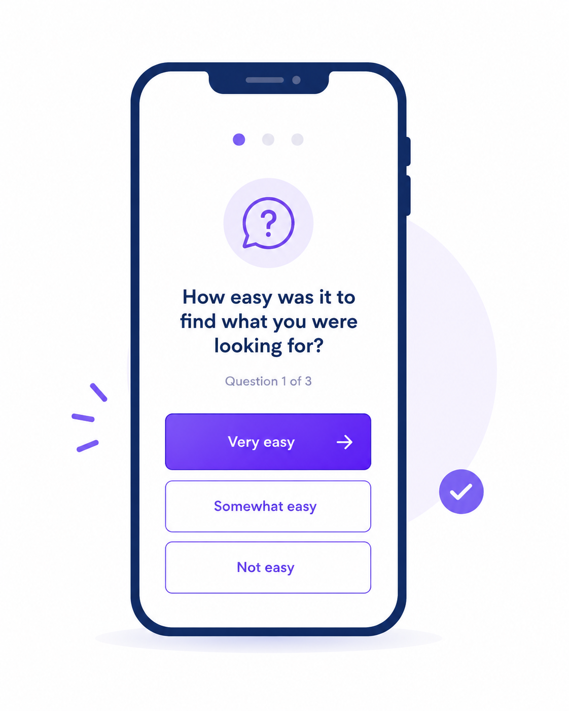
One Question at a Time: The Mobile-Native Format
The most significant structural change you can make to a form's mobile completion rate is switching from all-questions-on-one-page to one-question-at-a-time format. This is not a cosmetic change — it changes the cognitive experience of the form from a task to a conversation.
On a mobile screen, a ten-question form displayed in full scroll is a daunting object. The user sees the first three questions above the fold, scrolls to estimate how long the form is, and makes a completion decision before they have answered anything. If the form looks long, they leave. The same ten questions displayed one at a time, with a progress indicator, present a completely different object: one question, one tap, next. The length is revealed incrementally, which removes the upfront cost estimation that causes abandonment before the first answer is given.
Progress indicators deserve specific attention on mobile. A text indicator — "Question 3 of 8" — performs differently from a visual progress bar. On mobile, where screen real estate is compressed, a slim bar at the top of the screen provides completion signal without consuming question space. The indicator should show completion proportion, not raw question numbers — a bar that is already at 37 percent after the first question communicates that progress is happening and that the form is not endless.
The multi-step form best practices guide covers the structural design of multi-step and conversational forms in detail. The mobile-specific insight is that what functions as a completion aid on any screen becomes near-essential on a small one.
What Kills Completion on Small Screens
The guide to reducing form abandonment covers the general causes of form abandonment. The mobile-specific causes are worth naming separately because they are different in character from desktop abandonment — they are interaction failures rather than motivation failures.
Error messages that appear above the field rather than below it are invisible when the keyboard is active. The user submits, sees nothing happen, and does not know why. The error is displayed above the viewport fold, hidden behind the virtual keyboard. Moving error messages to below the relevant field fixes this entirely and costs nothing to implement.
Long dropdowns with many options are disproportionately friction-heavy on mobile. A dropdown with fifty options requires scrolling through a native picker wheel — a slow, imprecise interaction on a touchscreen. For any dropdown with more than eight or ten options, a searchable select field or a typeahead text input is substantially more usable on mobile. This matters particularly for country selectors, industry dropdowns, and timezone pickers.
File uploads on mobile are complicated by the file access model on iOS and Android. A file upload field that is intuitive on a desktop browser becomes an opaque interaction on a phone, where the user must navigate through a native file picker that looks different on every device. Where file uploads are necessary, place the upload field as the last question in the form so that completion of all other fields is not lost if the upload step fails or confuses the user.
Testing Your Form on Mobile Before Publishing
The simplest mobile test is also the most often skipped: open the form on an actual phone and complete it yourself. Not in a browser developer tool's mobile emulator, but on a real device with a real virtual keyboard and real touch targets.
The specific things to check: does the keyboard that appears for each field match what you expect to type in it? Do tap targets activate on the first tap? Does the form scroll correctly when the keyboard appears? Is the progress indicator visible above the keyboard fold? Does the confirmation screen display correctly after submission?
Completing your own form on mobile once, before it goes live, finds the majority of the friction points that will cause real users to abandon. The emulator in the browser developer tools does not activate a virtual keyboard, does not test real tap accuracy, and does not reproduce the specific rendering issues that arise on real mobile browsers.
Open the AI form builder, describe your form context, and include "optimised for mobile, one question at a time" in your prompt. The generated form applies the conversational format, appropriate field types, and touch-friendly controls by default.
Create a free account to save and share your mobile form →
Free plan includes 100 responses per month and 3 AI form generations. No credit card required, and no account is needed to try the generator on the homepage.